Overview
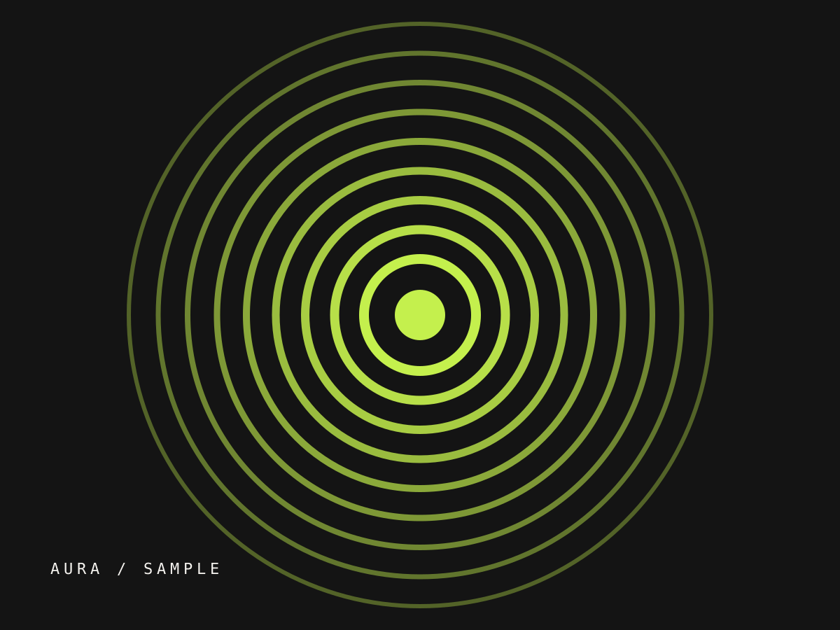
Aura Energy is a fictional demonstration project exploring how a wellness drink brand could feel both athletic and calm. The identity is built around concentric ring geometry — a visual metaphor for sustained, layered energy. This case study is sample content and does not represent real client work.
Challenge
Energy drinks default to aggressive sports aesthetics. The brief for this sample: could a can feel premium, quiet, and still unmistakable on a crowded shelf?
Concept
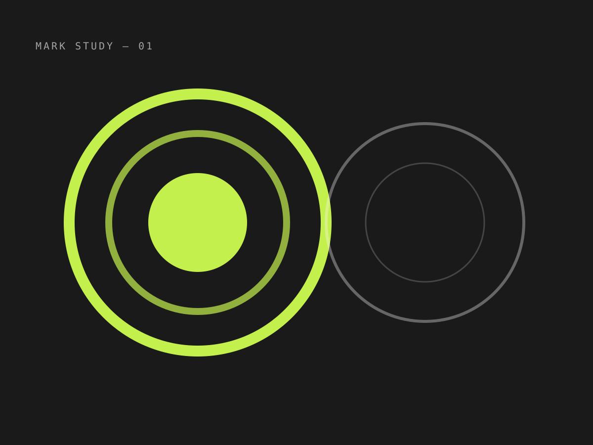
A single generative rule — nested rings expanding from a core — produces the logo, the pattern system, and the packaging hierarchy. Typography stays geometric and unfussy so the rings carry the expression.
“Design that whispers still gets heard — if the system is tight enough.”
Project note (sample)
Outcome
A flexible identity kit: primary logomark, ring-pattern library, three can architectures, and a type scale for retail and social. As demonstration work, it exists to show process and craft.